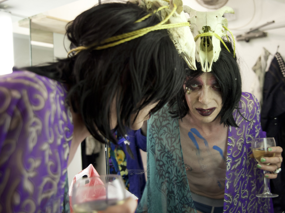
This year I finally got my act together and entered the National Portrait Gallery's annual exhibition 'The Photographic Portrait Prize'. I chose to enter one of my portraits of David Hoyle snapped in his dressing room at the Royal Vauxhall Tavern, as this is a sustained project that we have been working on for a couple of years and I feel we have got to a point where we have a number of good portraits.

Initially all you have to do is give the NPG a title and pay them some money, so I had a while after the initial deadline to make a final decision on which one I would choose from the series 'David Hoyle - Paralell Universe'.
Upon entering I was confident that I had lots of pictures to choose from that were strong enough, my main concern was that they were snapped spontaneously using just the available light in the dressing room, there wasn't a sitting as such and no special lighting which is part of what often makes a stunning portrait, however I felt that his character radiated through as well as our relationship and the intimacy he has allowed me in giving me full access backstage...
Once I began the process of selecting that one amazing portrait that would hopefully capture the judges eyes and hearts, I began to lose my confidence and question whether I was good enough. I scanned catalogues from previous shows and wondered did we fit in, did we have a hope in hell? Many of the portraits chosen are beautifully lit and there is a bit of a trend in the types of portraits that make it through... there certainly hasn't ever been anyone who looks like David in there! I wondered do I think these portraits are good because I love my subject, what makes a winning portrait?! At times I thought who do I think I am entering such a prestigious prize and doubted my talents but other times I thought WOW these are great and could fit in!
With about a 1% chance 60/6000 entries I think roughly, I really will be amazed if we make it but the process has been massively beneficial in analizing my work and thinking to the future... I asked a number of friends and colleagues for their opinion and have really appreciated their input...
This is David's choice, of course he went against the grain in choosing this rather messy one showing him in a beauty pose amidst the chaos of his dressing room,
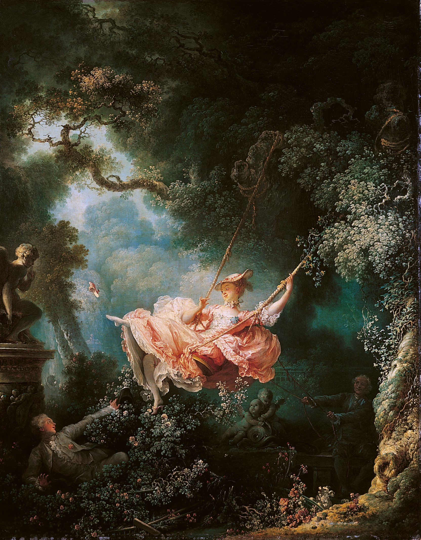
which he rather cleverly compared to Fragonard's 'The Swing'!!
His choice made me think differently in what I was looking for and I thought perhaps you're right - lets just go for it...
But after talking with others, I lost my nerve and decided to go with something more traditional - in David's words "the old man with a painted face..." Oh no, don't say that, I said - is it a cliche...!"
I eventually got it down to 2 portraits and had them both beautifully printed at Metro. Much of my work doesn't make it to print these days so the process of making a professional print was also of great value.
This portrait was the favourite and has indeed appeared on one of David's flyers and posters... It was descibed as something less familiar, it draws you in...
Whereas this one, which was my favouite initially was descibed as a more familiar image, like an actors portrait almost, I hadn't realized this so that was interesting, although it put me off a bit until I saw it in print - and as suspected the colours really sang, so this is the one that I chose in the end.
I hand delivered it to LCC and out of the few I saw in the que I thought yes it held its own and even stood out so who knows - I really will fall of my chair if we do get in, but it's about time they had this wonderful representative of the "trans-spirit" on their big posh gallery walls!!


